My overall thoughts
My favourite technique to apply was either overlaying textures or solarisation. Both techniques create unique, appealing, stunning and creative outcomes for the photographs. For all the images I altered the contrast, brightness and levels, this was to make the image look the way I wanted it to and improve the quality of the image. When editing the photographs I tried many techniques to apply and see which worked best. Each technique was easy to apply to the photographs and was done in Photoshop; it was also a very fun process as I love editing images. The technique I applied the most is solarisation as I like the effect it has on an image, it makes the object become the main focus changes the entire look of the image. The solarisation technique when used for photos of old buildings it makes the buildings more detailed and old-fashioned which is something I want to achieve when I apply it to the photos I pick out. One of my final images has been created by using this technique, I have written more about the image below. I also created many pinhole photos as I like the effect it has on the photos, again I have written more below. The angle I preferred to photograph with was a low angle as most of the buildings I photographed were tall and towering above me, a low angle helped me to frame and showcase the objects and buildings in the most effective and creative way. When photographing in Bradford I noticed that there was a majority of old buildings and only a few new buildings, this sort of limited my options of which buildings I photographed. This was the same for Leeds as the type of building I saw the most was new buildings, this meant I photographed the most of my new photos in Leeds and I photographed most of my old photos in Bradford. I liked this as my favourite type of building are old buildings as more thought went in to the design and what the building would be used for. I also do like new buildings as they have a more creative layout and use more glass however I still prefer old buildings for there quality in structure. My favourite part of this project was using the film cameras as this is my second time and I knew more and believe this affected my photos, I felt more confident and less constricted when using the camera. We also used a colour film camera which allowed me to focus on objects with bright vibrant colours that would stand out to the viewers. We used the colour film camera in Leeds and which was great as it has more new buildings which now include colour into their design.

This photo was taken in Bradford city centre as there are many old buildings that I wanted to photograph. The colors of the building attracted my attention as the buildings stands out and when light is on the building the colors become more vibrant and strong. The way I edited was creating a border to frame the building so that’s it the object the audience focus on the most. I also adjusted the contrast and levels to improve the way the photo looked, this also changes the intensity of the color of the building. Here I used a low angle to photograph with as I believe it is the best angle to use when photographing buildings. The reason I focused on this part of the building is because I believe it’s the most interesting part of the building, the windows shown have eye-catching panes in them as to me they look visually appealing. The brick detail is also something that attracts attention; there is also the feature near the top of the building which looks interesting to look at. I have incorporated the ideas of Alexander Jacques as in his work he has leading lines that lead the attention of the viewer.

I edited this photo in two ways however there is some similar things, such as the border that I created at the bottom of the image. I did this to frame the photo in a creative way which would add a creative flair to the image so that it wasn’t just like the rest of my images. On the second image I have added a filter which also helps achieve the creative flair I wanted, I found this filter in the filter gallery, I was experimenting with the filters until I found something that worked and improved the photo. The key aspects of this photo I want the viewer to focus on are: the person, the car and the building. The building because they are the subject matter of this project, that is why the building is central in the image. The person as she represents ever day life and how this street is still in use. The car because it also represents everything the human does and also leads the viewer into the photo. One thing that I don’t like about the second edit is that added the filter makes the detail of the building become blurred and messy which makes the building look merged which means it becomes less of a main focus for the audience. I used a mid angle when photographing to showcase the building and the foreground so that I could include the person and the car.


Using the technique of burning negatives was something I want to apply to this photo but using Photoshop instead of burning an actual image. I believe the technique can be applied using Photoshop as shown above, to apply the technique you have to use the burn tool and go over the image with the tool. This darkens the image and affects the sky as shown above in this photo. My favorite part of this image is the sky as using this technique makes it look more detailed and colorful and more attention grabbing. There is one thing that irritates me about the side of the image, the two rings are distracting and divert attention as they are clearly visible. I am again using a low angle to photograph, this is because of the reason stated before, while researching I found out that Alexander Jacques uses low angle for his images and I wanted to create the same effect he has in his work. As the sky surrounding the building is lighter then the building itself it makes the building stand out, which diverts the attention of the viewer to the desired location that I wanted. I occurred with a problem while using the burn tool, when it’s applied to an area if you go over the same area it goes darker; this meant on the building some areas were darker than other areas. The way I combated this was select the area I wanted to go over with the burn tool and cover the area once then cover until I have the desired result.

This image was created in the by using a technique that has similar result to solarization however it has a different method to achieve the result shown above. The method is very simple to use on images, it requires you to reduce the saturation and then create a v in the curve menu, which can done using the draw tool, and this is just two steps to creating this type of image. I applied this technique on this photo as I wanted to highlight the branches so that they created lines that attracted the viewer, diverted the attention of the viewer and was the main focus for the viewer. I understand the subject is not a building and why I photographed a tree as I saw the branches and thought it would look good when overlaid over another image, I was going to use this for the technique of overlaying textures. I used a low angle for this photo so that I could get the section of branches I wanted, going under the tree allowed me to do this as I could readjust myself to the best place to achieve this photograph.

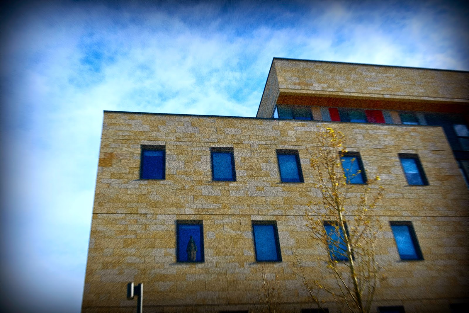
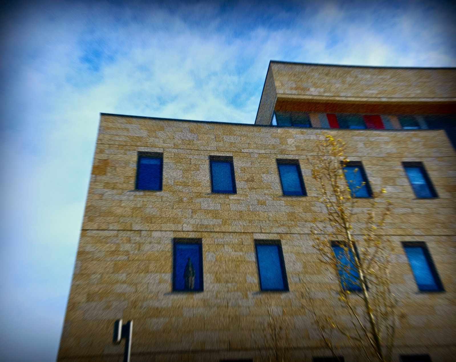
This is my personal favorite image that I have created; this is because when I applied the technique I fell in love with the result. As the object is defined in the image and the building is the main focus for the audience as its positioned central and detailed which attracts the attention of the viewer. The way the sky looks also helps the building stand out as its lighter shade then the building, this highlights the building. The technique I used is the same one I wrote about above. Changing the contrast and levels was a major factor in this end result, as they had an excellent effect on this image. This photograph was inspired by the work of Alexander Jacques as the patterns shown move the viewer across the image. I think this photo has a faint 3d effect as it looks like the building is coming out of the photo which I think is very unique and makes this photo arty and interesting. The detail of the building is clearly visible which improves the photo, also this helps keep the attention of the viewer. In this image the central focus is the near top of the building, there are many lines leading to this central point. I photographed this building because when looking at it I was fascinated by the shape and the detail the building has so I used a low angle when taking the photo.

I was very creative as I painted on this image; this was done in Photoshop using the paint tool. I wanted the paint to not cover the entire page so I created lines that are shown on the image above. I chose the colours blue, pink and white as these are already in the image however I altered the shade and intensity of the colour so that it would show and stand out in the image. The colours give it a creative twist as this something you don’t normally see on images edited in Photoshop, as it’s more used practically on actual physical photographs. I matched the colours to the section of the photograph; I did this by highlighting the desired area and picking out the colours to paint onto the image. Altering the type of line the paint brush left was a difficult decision as I experimented and some I like and some I didn’t, however I went for this one, which is crayon, to give the image a rough and sketchy look to it, making it look like I physically painted the paint on. My favorite section is the sky as it’s messy and uncoordinated, just like me, I did this to represent myself in my work and paint with all the colours of the wind, on this photograph.

This is one of my examples of a photo that has the overlaying texture technique applied to it, I chose this two images as I thought they worked well together. Both were taken in Bradford and were taken with a digital camera in the centre of Bradford. The image of the outline of the human is the image I wanted to be the main focus, as it’s something you don’t see every day while in the streets of Bradford. I didn’t want the overlaying texture to be stronger in intensity then the main image, as I didn’t want any focus or vibrancy to be lost from the main image that I wanted the viewer to look at. What I like about this image is the colours on the side as they create a kind of frame for the image and also are inviting and appealing to look at. The photo of the outline was shot at a eye level angle as when looking at the object it was eye level to me. The second image was shot using a low angle as I wanted a landscape building photo with just the tops of the buildings.
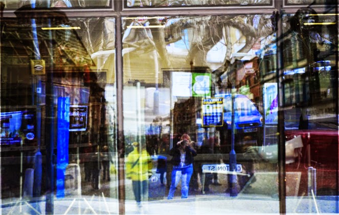
This another photo with the technique of overlaying textures applied to it, However for this photo I do believe I isn’t more successful than the previous example. Although you can see both images there isn’t really anywhere to focus on as the image is a bit all over the place and does not include a main point for the viewer to look at. As there is bright, vibrant and eye catching colours this makes the second more visual and the photo that attracts the most attention. These images have a lot of blue included in them; this was done because I wanted a theme colour in this edited photo. Both were taken at eye level while I was on the streets of Bradford. The way I apply an overlaying texture technique to photo is by place two images in Photoshop and reducing the opacity of one of the images, this creates this effect.


This is my first attempt at soalarsation and I wish I had a better result as the only part of this image I like is the banner as it’s the appealing factor of the photo. One thing that lets this photo down is the background as it’s too distracting as fussy and cluttered which diverts attention from the banner, which I wanted to be the main focus. If the background was either black or simple I believe the fence would have framed the banner very well and make the photo look effective. This technique was created by reducing the saturation and then inverting the photograph, this is the result however I do have more successful photos shown below. While photographing I experimented with angles and framing, I wanted to showcase this in this image, It is also shown in my set of abstract photo selection.

This is using the same effect as the above photo however
here you only have one thing to focus on, which makes it a more successful image.
This effect makes the object look like it’s been placed onto paper and not that’s
it’s a 3D object which I think is unusual but interesting. The lines go in and
out of the image and this makes the attention of the viewer back to the centre
and the to either side. I wanted the object to be the only thing in view and
the only thing the audience focuses on.


These are my examples of photo weaving; this is a technique
that I found a bit difficult to create in Photoshop. This may be due to the
fact I picked photos that had many lines going in different directions. If I were
to recreate I would do it with a physical photo to have more creative quality control.