Monday, 3 November 2014
Edits with titles
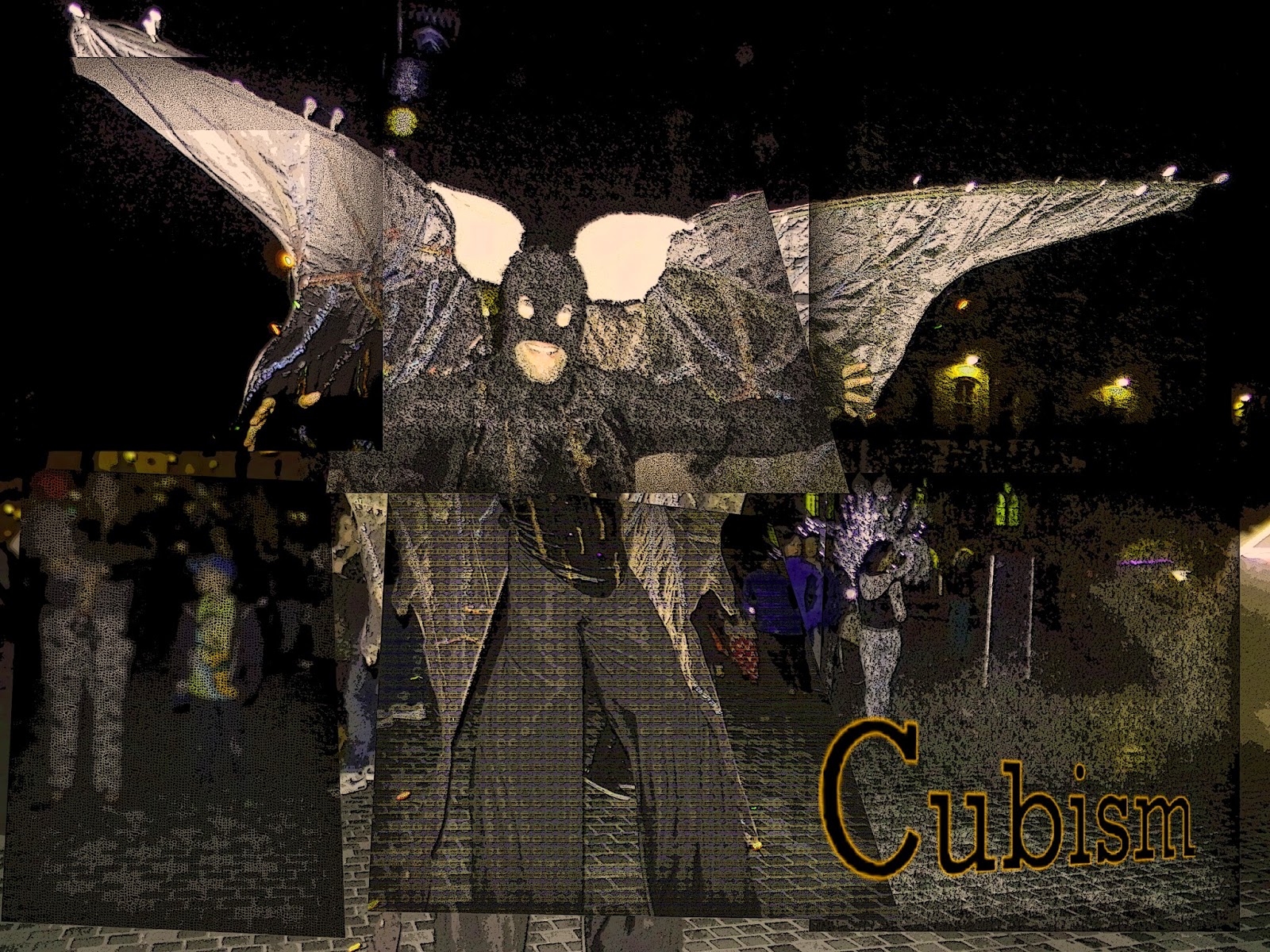
These are my final images , i have taken photos i have shot and added effects to them in Photoshop. I believe the best one is the cubism one that features the fog as i love the position of the text and the effects i have added on the text. To achieve the look on the text i selected the letters individually and added lines of paint , then i used puppet warp on the text to adjust the position and size in a creative way. As the placement of text is important on a cover i had to take this into consideration when adding the the text, most of the text is placed to the side however there is one where it is placed central. This drags the attention the center of the image and i placed the text this way as the sections of image i edited pull to the middle of the photo and i wanted to link this to the text.
Labels:
Unit 3
Subscribe to:
Post Comments (Atom)


No comments:
Post a Comment