Showing posts with label Unit 3. Show all posts

Tuesday, 4 November 2014

Evaluate

Final evaluation

I ended with this as my final image I are using for my book cover as the way the editing that I have applied onto the fog makes it look unique and defined in the photo. As the text is not simple this enhances the theme / idea of cubism in the photograph. The fog part look like it has been added over the image, it looks like i have copied and pasted on the original image , this effect is also create with the part of the image I have boxed and edited. To make the fog more effective i added a color filter to make that part of the image to be more defined within the image. I also bend'ed the boxed edited part as to make it mold differential apart from the rest of the photograph.

As the main point of intrest in the image and i wanted to enhance the quality of them so i edited them so that they looked more futurist to fit with the theme. i wanted to title to be placed correctly in the image and not to overshadow the rest of the image and i believe iv'e achieved this by having the colors dimmed down and not in the face of the viewer. achieving the orange glowing look on the lights was done by added a filter and adjusting the levels , this was to improve the look of the lights as before the lights were too bright and slightly over exposed which is not the look i wanted to achieve. Picking this photo was because the framing of the lights as even though there is a lot going in the photo there are many points of focus in the photograph, and is most of futurism photos there is a blur and there inst one here the figures in the image represent movement which creates an image of people dancing in the viewers head. 

Planning


My plan for photo shoots 

First: 

My idea is to find a subject that can fit to the idea of futurism and cubism, the item I have chosen for my first photo shoot is my bowler hat as it is a unique item that interests me. 
  I did come across a problem before carrying out the photo shoot as it was difficult to photograph this objects in different angles as at nearly every view the item looked the same, which however was difficult it will be immensely easy to be able to place the object in different locations. I plan to use the college grounds to find the different locations I will be using to take photos at. The weather may be a factor I will have to take into consideration as it may become unsuitable to work in, if horrible weathers does occur I will try to locate places inside that can be used to their advantage.  

What i will do with the photos: 
i will hopefully use these photos to create my final cubist image as i believe if I edit the photo to looked cubist and creative it will create a really arty and unique final image.   

Second:
 There is a light festival happing in Bradford and i plan to use this to my advantage as to photograph them and create futurist themed images. Weather is another problem i may come across again and  to overcome it i will dress appropriately and ready for rain or freezing temperatures.  i will not be supplying the props this time as i will be photographing something that is being displayed for the public. There are more risks on this shoot however i will come up with ways to avert anything that is potential hazardous. 

What i plan on using the photographs for: 
Creating a set of photos for futurism then using them for my book cover about futurism. 

Risk assessment

RISK ASSESSMENT TEMPLATE FOR Cubism / Futurism Project:


Assessment Reference:
Unit 3
Activity Description:
Taking photographs in city park
Date:


Student

Rebecca Ingham
Review Date:

Assessment Team Members:

Overall Potential Risk Factor:
Possible
Course Details:
90 Credit Diploma Photography


Number of People Exposed:
2


Names of People Exposed:
Rebecca / Jess
Building-Place & Exact Location
City park (Bradford)
Is This An Acceptable Risk?
No


Hazard
Persons At Risk and How
Existing Control Measures
What are you currently doing to prevent it?
Probability
Severity
Risk Level
Additional Control Measures
What else do you need to do?
Probability
Severity
Risk Level
Being attacked or mugged
Walking around Bradford at night
Protecting each other to make sure everyone is safe ( in the group)  
1
1
2
Make sure ever thing of importance is secure
1
1
2
Death
walking on or near busy roads
making sure to look and asses where traffic is when near these roads
0
5
5
make sure to be safe while crossing the streets
0
5
5


Assessment Conclusion
There is only really one potential risk and there is are many ways to prevent that anything that bad or worse may occur.  


Monday, 3 November 2014

My Cubism edits

Cubism


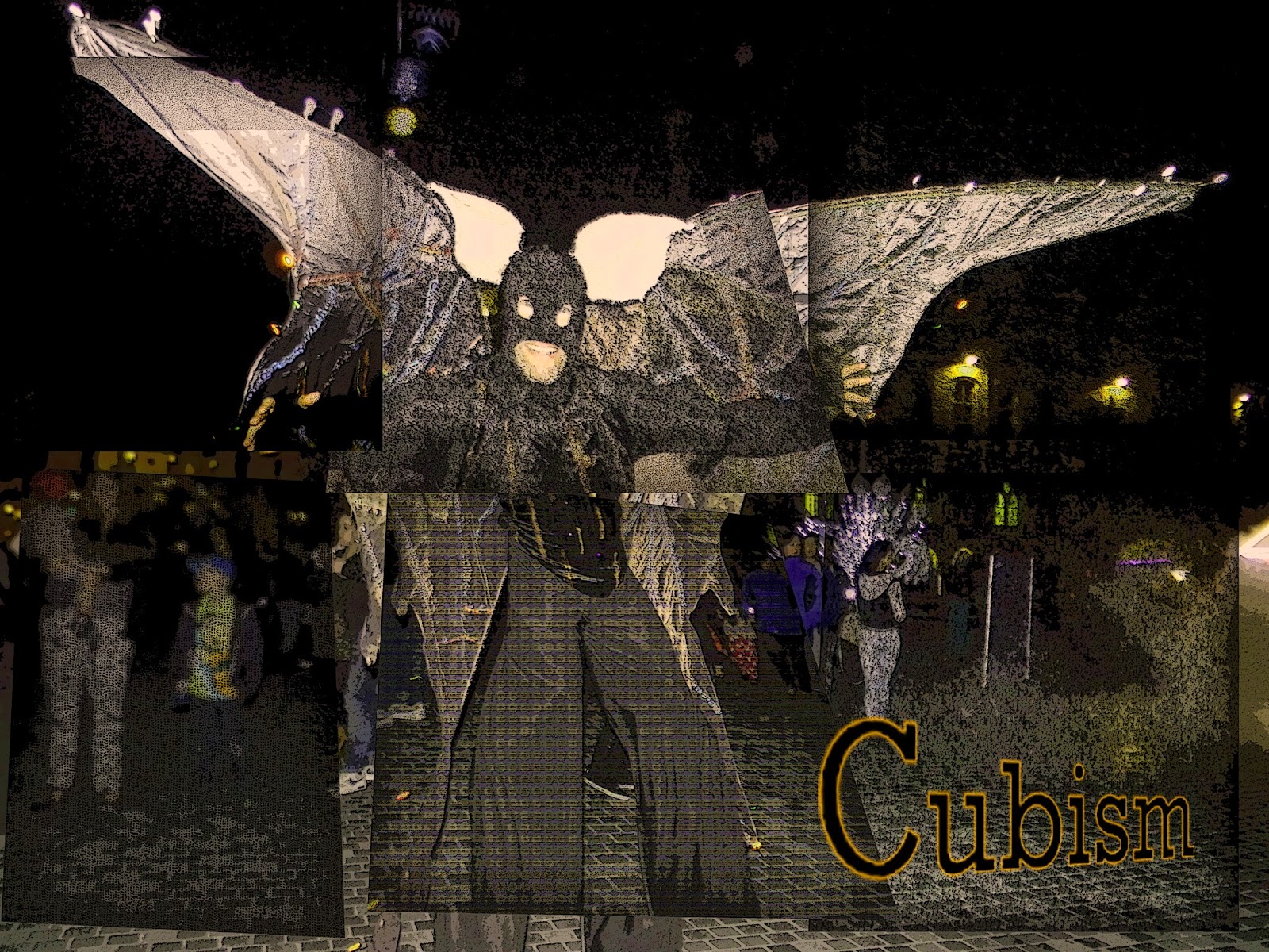
These photos were also taken  in Bradford and were reliant on the lights in the photographs as these make up the points of interest in the images that the audience looks upon. In most of these photos the background is mostly black , this is because the photo shoot was at night and this helps the photos fit with the theme of cubism. i edited one image two ways to show variety of edits that could be made from one image and the way a photograph can be changed. I framed the objects in each photo to be central in the frame so that the viewer could see the entire object in the frame. There isn't one set modal/ subject matter for these set of photos. I believe the best one is the first one as the editing that i applied to the image came and applied very effectively to the final outcome of the photograph. The photo that was easist to apply cubism was the second photo as i used cubism to mold the parts of the image to bend towards the centre. The theme of future links into the set of photos as the subjects are futurist. 

Edits with titles


These are my final images , i have taken photos i have shot and added effects to them in Photoshop. I believe the best one is the cubism one that features the fog as i love the position of the text and the effects i have added on the text. To achieve the look on the text i selected the letters individually and added lines of paint , then i used puppet warp on the text to adjust the position and size in a creative way. As the placement of text is important on a cover i had to take this into consideration when adding the the text, most of the text is placed to the side however there is one where it is placed central. This drags the attention the center of the image and i placed the text this way as the sections of image i edited pull to the middle of the photo and i wanted to link this to the text.

My futurism edits


This were also taken in Bradford, when taking the images i didn't know about the project and even though these weren't planned I believed they were be useful to use within the project. Every one of these images have been edited in Photoshop, all the editing process was to enhance the theme and sense of movement and futurism  to make the photos fit with the project. A setting was difficult to settle on as it was hard to find the perfect setting to achieve a good photograph, that evokes the sense of movement and speed. The third image was editing to achieve the look of motion blur around the object, this was done by painting around the subject matter then turning the opacity down. Editing these images was easy as the ones that took the longest was the second and third, the second one was made by copying and pasting a copy of the object with the opacity lowered so that the different images are overlapping. Night time was great to photograph in as it made the lights stand out and become very vibrant and a point of interest that draws the attention of the viewer.

Sunday, 2 November 2014

Cubism and futurism Mood broads

Colour
This mood broad includes my hand made cubism photos these are the main images in the middle, i used the images as i believed they portrayed color very well as the different shades of color used in magazines. The way i created this images i used clippings from magazines and i complied them to create these final effects. Placing the feathers on the page add a different element to the page. As color is represented in a creative way i wanted to express this on my page and this why there is no set order on how i l have placed the images. 


 Texture
Images are overlaying here as i believed the different textures would look awesome and creative linking into in each other. As the colors are minimalist in vibrancy i didn't have to worry about some photos bringing the focus over other photos. The color most used is grey as it appears in most of the photographs used, this wasnt done on purpose however it was hard to find photos of texture without using this color. This helped me link the photos on the page and was most effective in the images used in the center of the page as the lines used in the photos aid the connection.  

Line
As i found it difficult to set up all the photos to connect in a contentious way i decided to lay the images in a way that was appealing to the viewer and I believe i achieved this by the way they are set out.  I espically love the set of photographs on the left side of the page as they all set a mood and link very unique, the lines used lead the audience into the image which i believe can sometimes be one of the main purpose of a photograph.   
 shape
The photos are placed this way to allow them be seen by the viewer as i didn't want any image to be cropped in a way that obscured the potential to get the full effect of the photograph. Only the theme of space seems be through all the photos as most do include color there is a select few that are black and white, this does not effect the images quality. Most are wide photos with not many including a large foreground, this i believe this was done purpose to allow each subject space to grow within the image it is situated in.   

Friday, 31 October 2014

Task1(b) Cubism

Cubism
 

My understanding:
 The Cubism art movement begin in the early 20th century which was created by George Braque and Pablo Picasso. Picasso work was mainly inspired by African art, this was he wanted to showcase how art didn't have to copy nature, as Picasso believed this was a outdated concept. Most of the art created from this movement used people as subjects, other things such as landscapes were rarely used. To make the image a cubist image the subject was dissected and jumbled then reassembled to create an abstract, version of the original photo. Many artists developed the movement, it was then introduced into sculpturing and architecture when it became popular.  

The two types of cubism :
Analytical cubism is a early version of cubism where in the image there is overlapping and multiple viewpoints on the image. this version of cubism is called analytical as it has a structured dissection of the subject to allow the viewer to not be distracted from the structure, and mainly focus on the mode and color of the image or art.

Synthetic cubism is a part of cubism that didn't take off straight away. This type introduced new textures into the art. The artist George Braque was one of the first people to use this in  their art as he placed material on his canvas, he did this to explore a new type of art which allowed a type of playfulness to be added to art.    

Artists of cubism:
Fernand leger

In these images not much of the original is left, this a clever effect to make the piece abstract and creative. Color is a key part of the image as well as color can effect the mode created by the picture.  Shading is also a main feature in Fernand work as on the second image each different texture / platform has different shading. I believe the subject of each is people and a bustling city scene, the second image represents how busy the city streets are and the sliver objects in the image i believe to be metal.